Phrasing in Color
 I love answering questions! In a earlier post, One Musical Leaf Falling I talked about using color to depict phrasing. This post is a follow up to answer a super question from a PA reader.
These creative learning ideas should really bring the music to life. I can see myself using the Opposite Game, and singing wildly with props and gestures, but… May I see a photo of a page of music that has been shaded with colored pencils to show phrase shapes and expression? It is difficult for me to imagine how this could look.
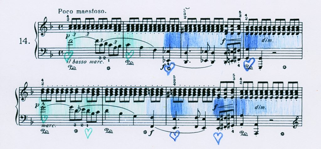
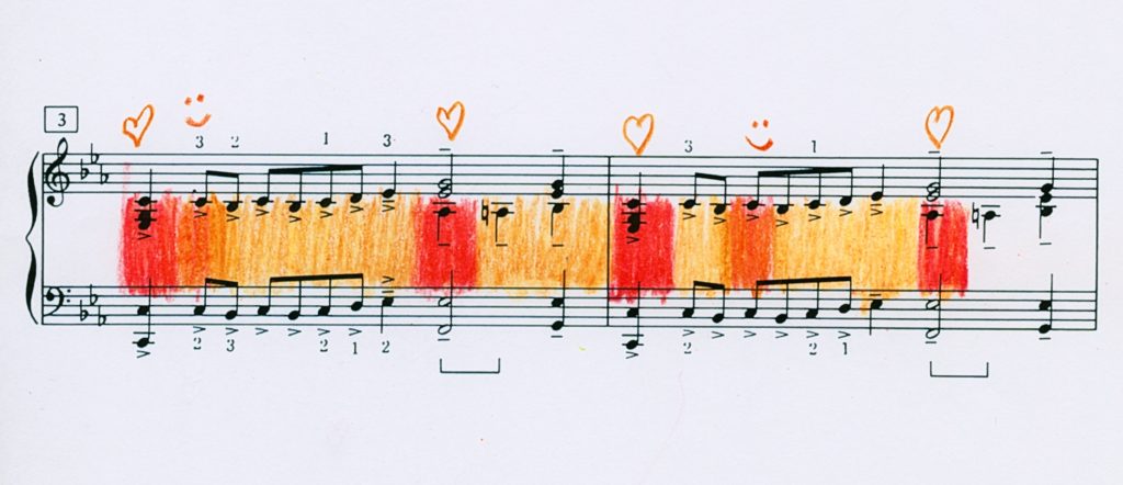
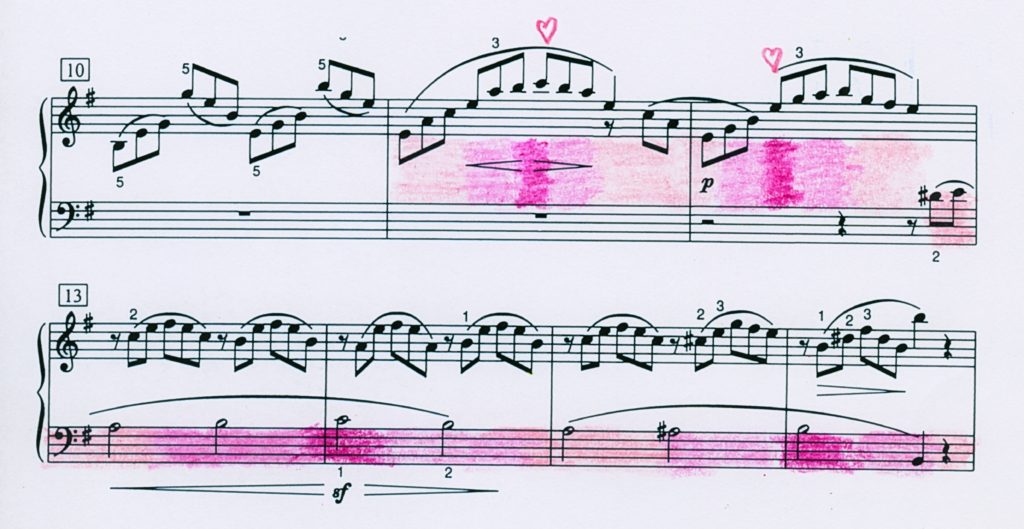
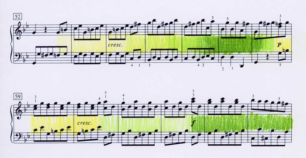
So, I’ve put four examples together for you. I hope they give everyone a jumping off point. I like to have students use photocopies to create different shadings of the same passage. I also do this activity with scales, arpeggios, and other technical elements.
Do pianists always shape phrases precisely as marked? Is the highest note always the peak of a phrase? Absolutely not always, repeats being a case in point. Being able to hear and create different shapes in sound fosters control and opens up possibilities for spontaneity. Sometimes we find out what something is (what we do like) by finding out what it is not (what we don’t like).
Generally, I like to have students use the darkest shade on their high point(s) first and work from there. This works with both gradual and terraced dynamics. By the way, this is a great group activity. First, everyone creates their own shading. From there, you can have students play their own or exchange them. My favorite pencils for this are Crayola Colored Erasables.
One important note about color. Color is quite personal. A character one person connects with pale pink might be green to another. A student of mine was having a frustrating time finding her voice in the G minor Fugue, WTC Book 1. She was playing all the notes but missing the music. We had tried every trick in the book and still the piece stayed the same.
One week I asked her what colors she associated with each section of the piece. Orange! She used colored pencils during the week to shade each phrase—from neon to tangerine to pastel peach. I don’t know where she found so many shades of orange but it worked. She found her voice and won a medal with a program that included that piece.
A student might use orange for a piece which might be the last color you would connect with it. That is OK. It’s not about you. It’s about the other person’s connection. Some students might even mix colors in a passage. As long as it makes sense to them and improved character and shaping are evident in their playing it’s all good. Just smile and nod…


In all three examples above, different high points were chosen for repeated material. In the Heller, in order to match the adventurous nature of the piece, seafoam was used for p and blue for f. In the Tcherepnin, reds, oranges and golds were used to depict its bright, energetic character. Pale to bright pinks match the delicacy of the Burgmuller.

The Beethoven is depicted in two ways. Measures 52-58 show a gradual crescendo while a terraced crescendo is shown in measures 59-64. The greens are positive and robust. (The yellow in this photo is much brighter in the photo than the actual yellow-green on the paper. Ahh, the joys of technology…)
For more ideas for connecting emotion and sound, check out Finding Inspiration: Redux


